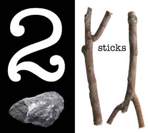
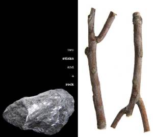
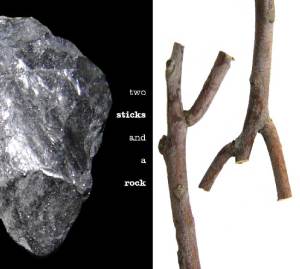
In today’s tutorial I’ll show you how to make a nice design using two sticks and a rock.
If you want to use the shortcut, go out and find two sticks that suit your fancy and a nice heavy rock. Lay the sticks on the ground and bash them with the rock. You will have designed…something…
Or, you can take the two sticks and smack the rock with them. You will have made music.
This tutorial is slightly more sophisticated, although you may be able to market your smashed stick work, and I encourage you to record your rock music and send it to record companies.
If you want to do the digital thing, download the images you’ll need for this tutorial.
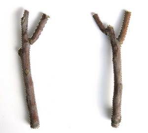
Here are your two sticks.
http://www.morguefile.com/archive/display/174851
During the development of this tutorial, the design team got involved in a long argument about whether or not it’s a picture of two twigs, and whether or not twigs qualified as sticks. There was an impassioned plea for using drum sticks, then the discussion degraded into philosophical differences over chicken legs versus turkey drumsticks. An attempt to bring hockey sticks into the mix was shouted down before body checks could happen. Someone mentioned glue sticks, and there was dead silence.
Ultimately the creative director insisted that we follow the intended spirit of the creative brief, and that we use images of real sticks as found lying on the ground in nature. So we were back to square one.
Nobody really cared about the rock.
I’m not quite sure when a twig qualifies as a stick, but I’m a designer, not a botanist, and these are good enough sticks for anybody, unless maybe you’re a jazz drummer and you need some real sticks. I suppose you could use those kind of sticks for your own designs. Don’t let me stop you. Substitute your own sticks or rocks if you wish. It’s not as if I’m watching you.
This looked like a good enough rock for anybody.
http://www.morguefile.com/archive/display/46850
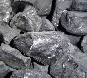
Purists may argue that it is a boulder, not a rock. In this case I might agree, so here’s a group of genuine rocks. You might want prettier rocks. I wanted rocks that would be easy to clip out in Photoshop.
http://www.morguefile.com/archive/display/99454
Open your sticks and rocks in Photoshop or whatever other image editing software you own. I have Photoshop so that’s what I’ll use. If you’re using Microsoft Paint you may find things a trifle more time consuming, but persevere. If you’re using PowerPoint…well, you must be the heroic sort.
First we need to isolate the sticks on separate layers. I assume you already know how to do this. If you don’t, please go find a tutorial that will teach you how to make clipping masks. Here we are dealing with sticks and rocks.
Now we need to pick a rock from the pile. Make a clipping path around one of the rocks and copy that to its own layer.
Then, copy and paste or drag your rock layer to your sticks image. By now you should have a layered image with the sticks on one layer and the rock on another. This, too, is a basic skill I assume you already have.
At this point a lot of you might say, “Hey, that’s pretty good, we’re done!” No, we are designers. It is never good enough. We are never done. We work on lots of projects to keep ourselves from picking at the ones we just finished.
Ok, we need to do something more interesting than laying a rock between two sticks.
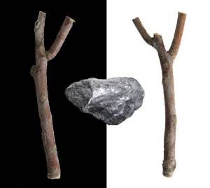
First stop: divide the background between light and darkness in order to force a strong contrast. I used basic black; it matches everything.
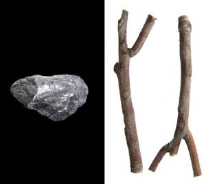
It’s a start, but as I said, not good enough. Now that we have a color contrast, let’s exaggerate the contrast between rock and wood by moving the rock to the left side and both sticks to the right side. I could have done the opposite, but I think the rock looks better on the black field and that the sticks look better on the white field. If you think differently, so much the better.
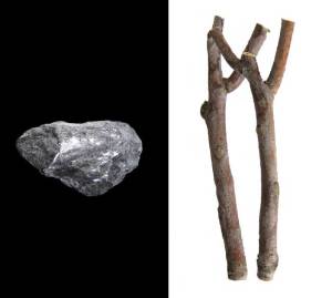
The rock hangs nicely in the black field. The sticks don’t look so good. Maybe flipping one of them will improve the way the negative space appears.
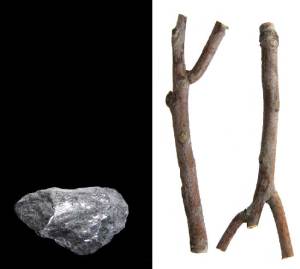
At this point I thought there was too much symmetry, so I moved the rock to the bottom of the black field. Rocks tend to sink, anyway, and this one isn’t pumice.
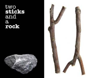
Time to try some text.
I wasn’t quite satisfied. Still too much symmetry, and the text block seemed a bit static. The negative space seems unbalanced.
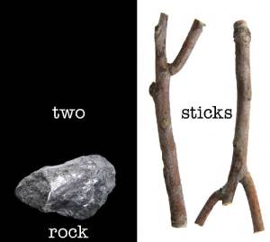
I tried rotating the rock slightly and minimizing the amount of text.
Maybe we could try this…not much better. The idea was to let the rock be self evident while hitting the viewer over the head with the two sticks.
Making the rock bigger helped the negative space. The text placement is mildly more interesting but only mildly.
Violating the edges of the layout resulted in better negative space and better balance between the left and right sides.
At this point, we could continue to move text around with or without a plan. Ordinarily I would sketch this all out before starting work.
We could probably have used a prettier rock, and there are many ways to colorize or otherwise adorn images in your favorite image manipulation program…which you already know, of course.
This concludes today’s tutorial. Thanks for reading.

